What happens if customers come to your business, go through your inventory, and then leave without purchasing anything? No purchase was made, and it just vanished. It occurs more often than you may expect. And to tell you the truth, it is quite aggravating. Waiting there, you can’t help but wonder what went wrong. The advertisements were successful. There was an influx of traffic. Nevertheless, something broke at the very last step.
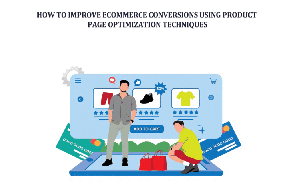
Your product page is the name of that phase. It’s not your advertisements. Not your marketing efforts. This is the page where product choices are made. At the point when uncertainty either rises or vanishes. Consider it to be similar to a store assistant. It is a calm one. Unless you decide to give it a voice, it does not speak. People leave if it is unable to help them in any manner.
I used to work with the proprietor of a little web shop. His traffic was satisfactory. Daily, hundreds of visitors. Despite this, sales scarcely changed. We did not alter his advertisements. Did not do any SEO work. We recently enhanced his product pages with more distinct images. Improve the copy, make the buttons more robust. In a few weeks, conversions tripled. That was not a miracle. Structure was the issue.
Optimizing product pages is indeed more important than most people realize. And occasionally even very little adjustments might have a significant impact on the outcomes.
Why Product Page Optimization Matters
There is more to a product page than simply a page. Now is the time to act. It is the defining moment, the moment when a visitor decides whether to trust you. People do not make immediate purchases. They are uncertain. There is a question. It is comparable. It is your responsibility to eliminate that hesitancy. Slowly, in fact. Without a doubt.
User experience is negatively impacted when a page is badly organized. Neither of them knows where to look. Is it safe to trust? Which button to click? Consequently, they go. However, when it is optimized, a separate process occurs. It is not difficult at all. Unruffled. You guide them through:
- What the product is
- Why it matters
- How it helps
- Why they should trust you
Suddenly, pressing the purchase button no longer seems hazardous. There is no need to yell on an excellent product page.
Use High Quality Images and Videos
So, let’s be honest. Nobody reads a book first. People are looking. One of the first things that a visitor observes is the picture of your goods. Trust is immediately lost if it seems to be dishonest, unclear, or lacking in detail. It is not said aloud by anybody. But they pick up on it.
When I was little, I recall looking for a watch. One such retailer just had one picture. Flat light. There is no specificity. A second individual had numerous shots. The close-ups. Wrist shots are taken. Real-life usage. I did not even bother to check the pricing. The second one was the one I trusted most. Such is the operation of images.
| ✅ Zoom option | ✅ Real-life context photos |
| ✅ Clean background shots | ✅ Clear images from multiple angles |
This brings us to videos. Videos impact every aspect of life. There is movement in them. It is true. A product video provides answers to questions before they are ever asked; a little movie that demonstrates how the product operates can immediately clear up any doubt. People remain for extended periods. They exert greater effort.
And the experience is made to seem seamless when you include a product gallery video plugin. It is not compelled. It’s only natural. One might say it allows the product to speak for itself.
Write Clear and Benefit-Focused Product Descriptions
The following is a common error that shop owners make. For example, they provide a product description. The technical. It is dry. Devoid of life. The features are not the primary concern of the customers. They are concerned about why it benefits them. It is not. This coat is constructed from waterproof material.
Maintain your dryness even if it rains unexpectedly. Recognize the distinction. There is a little change. The effect is significant. When you write, pretend that you are having a conversation with a real person. It is not a presentation to a boardroom. Your description ought to provide an answer:
- What problem does this solve
- How does it make life easier
- Why is it better than alternatives
Also, keep it readable. People scan. They don’t read every word. Use:
- Short sentences
- Bullet points
- Simple language
There are instances when a tiny flaw in the writing makes it seem more real. It is not mechanical. It is not compelled, because individuals have a connection to the actual, not to something without flaws.
Optimize Your Call to Action CTA
Right now is the time to act. Where the decision is made. This is your call-to-action button. You’d be surprised how many stores hide it. Alternatively, you might make it blend in. Or use uninteresting language. Not a problem, add to cart. However, it is not always sufficient. Imagine how it would feel to you.
- Is the button easy to see
- Does it stand out
- Is it placed where users expect it
Does it generate a sense of urgency? A compelling call to action (CTA) should seem like the next logical step. This is not a push. Experiment with different variants. Experience a variety of genres. A seemingly minor alteration, such as a change in color or language, may sometimes prompt a behavior change. And sure, it seems straightforward. However, the most effective solutions are sometimes the simplest ones.
Build Trust with Reviews and Social Proof
People do not have faith in shops. They trust other individuals. Said, that is how it operates. There is less room for uncertainty when one sees that other people have purchased and enjoyed a product. Indeed, not entirely. However, enough is enough. In my own experience, I never purchase anything without first reading reviews. Even the smallest of things. It has become a routine lately. In light of this, your product page needs to have:
| ⭕ Customer reviews | ⭕ Ratings |
| ⭕ Real feedback | ⭕ Photos from buyers, if possible |
Just a few reviews might be helpful. They do not have to be entirely flawless. In point of fact, excessive perfection seems to be false. A mixture has a genuine feel. One cannot rely just on design to establish trust. It is developed using evidence. And the evidence that we need is social proof.
Improve Product Page Speed and Mobile Experience
On a product, you click on it. It takes quite some time to load. Wait for it. Perhaps three seconds. Perhaps five, and then you go. That’s how the vast majority of users act. The importance of speed cannot be overstated.
People tend to assume everything else is sluggish when your site seems slow. Assistance. It is delivered. Assistance. Right before you even display your goods, you lose people’s trust. Pay attention to:
| ⭕ Fast loading images | ⭕ Clean code | ⭕ Minimal clutter |
Then there is mobile. The majority of consumers are now using their mobile devices with one hand, scrolling only in part and paying attention only in part. If your website does not function properly on mobile devices, you will lose a significant portion of your sales. It ought to be simple to press the buttons. Ensure that the text is readable. The arrangement mustn’t feel claustrophobic. It is no longer a subject of choice. This is a fundamental expectation.
Provide Detailed Product Information
Clarity eliminates uncertainty. Conversions are stifled by uncertainty. When individuals are unable to comprehend anything, they do not purchase it. Therefore, provide all of the information that they need. Be careful not to overpower. Balance is important. Include in:
| ⭕ Size details | ⭕ Material information |
| ⭕ Usage instructions | ⭕ Compatibility if needed |
FAQs should also be included. There are occasions when they are more effective than lengthy paragraphs. Consider the queries a client might ask. In such a case, respond to them before they ask. It has a contemplative quality. It also helps build confidence. As users feel educated, they feel secure about making more purchases.
Use Persuasive Pricing and Urgency Techniques
There is more to price than simply a number. As a signal, it is. The way you portray things alters perception. People get the impression that they are receiving a good bargain when they see a discount. It doesn’t matter whether the change is little. Messages with limited supplies convey a sense of urgency. However, they must have a genuine feel. It is not a fake. You may give it a go:
| ✅ Highlighting savings | ✅ Indicating low stock |
| ✅ Showing original price next to discounted price | ✅ Offering bundles |
However, you shouldn’t go overboard with it. Excessive eagerness is seen as aggressive. Also, individuals dislike being forced to do anything. The secret is to be subtle at all times.
Simplify Navigation and Layout
Clutter is a source of confusion. Simplicity is a powerful motivator. Users will be confused about where to look if your site has too many items. The focus of their attention shifts. Moreover, choices are made more slowly when attention is divided. The layout should be tidy to assist direct attention. Things that are significant need to be highlighted:
| ⭕ Product image | ⭕ Title |
| ⭕ Price | ⭕ CTA |
All other evidence supports them. Whitespace is beneficial. Structure is beneficial. Flow is important. Imagine it as a tale at this point. The transition from one portion to the next. Very easily. Users tend to stay longer when the experience is perceived as simple. Additionally, remaining for a longer period of time often results in purchasing.
Leverage A B Testing for Continuous Improvement
No single page is flawless. Including the very finest of them. What is successful now could not be successful tomorrow. Changes in user behavior occur. Because of this, testing is important. You give something a shot. It is measured. Make it better. Examine items like:
| ⭕ Headlines | ⭕ Button Colors |
| ⭕ Image Styles | ⭕ Layout Changes |
Sometimes the outcomes take you by surprise. An adjustment that you consider to be insignificant turns out to have a significant influence. To put it another way. That is OK. There is no room for speculation in optimization. This is all about education. Then adjustments were made.
Conclusion
Increasing the number of customers who purchase from an online store is not about using tactics. To comprehend what others are feeling, what they are uncertain about, and what they need to see before they can believe anything is essential. Each of these elements is brought together on your product page. The design. The content. The field of psychology. The experience. In addition, when it is successful, it does not feel like selling. It is a normal feeling. The guest has arrived. investigates. comprehends the situation. After that, a decision is made. No need to worry. There is no misunderstanding. To clarify things. You may begin with a small amount. You should fix your photos and add WooCommerce product videos plugin. Read more about woocommerce plugins explained for eCommerce here. Refine the copy you have. Adjust your call to action. Afterward, proceed in a step-by-step manner.